CATEGORY:
RESTAURANT,
FAST FOOD
_
THE RESTAURANT BRAND RECIPE_
We were approached to create a brand identity for a first of its kind restaurant. The core offering of the restaurant - Dishes cooked in only 2 ways: Flame Grilled and Baked. The challenge was to use the first initials of 3 names, FNB, which held emotional significance for the client and incorporate them in the restaurant branding.
Based on the client's vision to create a dine-in restaurant with a touch of class, we developed a Brand Mark (logo) with a signature flame icon set on a contemporary typeface (font) to strengthen the core vision. We developed the tagline 'Flame & Bake', which wonderfully positioned the restaurant and gave further meaning and a better connection (for the consumer) to the initials FNB.
We further developed and supported the branding with signage, menus, carry-bags, boxes, web design, etc.
DISCOVER COUTURE
-JEWELRY BRANDING-

CATEGORY:
JEWELRY,
RETAIL &
MFTG.
_
DISCOVER YOUR BRAND_
Discover Couture is a collective of artists & artisans well versed in the cultures of the world. They understand that, for centuries, female adornment has been an important part of every culture and even more so at this present age.
The jewelry brand is aimed at a predominantly female target audience. Their philosophy - "Encouraging a discovery of self through artistic expression". As such, they offer a complete spectrum of design and artistic elements, be it precious or semi precious stones or any medium like metal, wood or fabric. Clients are invited to express their individuality or consult any of the artists and artisans on board to design jewelry and/or boxes as they desire. Clients can also purchase pre - designed selections of jewelry and box sets from the catalog.
After laying out the brand strategy, we positioned this jewelry brand on the platform "Discover You". We developed a logo that captures the essence of an exciting jewelry brand philosophy and this is demonstrated through use of typography & graphic shapes to depict a jewel box with a partially open 'lid', that represents undying curiosity, which ultimately leads to discovery.
The style of iconography and typeface were selected to highlight the fashion aspect of this versatile jewelry brand that appeals to audiences from around the globe, be it New York or Dubai.
OTHER ELEMENTS: STATIONERY, CATALOG, BAGS, ETC
PEARL EYE CENTER
-MEDICAL CENTER BRANDING-

CATEGORY:
MEDICAL,
HEALTH SERVICES
_
EYE OPENER_
KERATOCONUS is a disease that can be easily missed in the early stages. The brief from our client was to communicate, through the print media, the need to initiate contact for a consultation at the slightest suspicion and to offer as much information as possible without causing alarm.
Click to Zoom
Our solution was to show an actual outcome of the disease if not diagnosed in time with a visual that is attention grabbing and illustrative. The words were crafted to create an interest to read further with a witty headline and supported with informative body copy and a strong call to action.
THE MEDIA:
We recommended high readership English Magazines and Newspapers most suited to the target audience.
QUENCH
-DRINKS BRANDING-

CATEGORY:
BEVERAGES,
RETAIL
_
QUENCH, NATURALLY_
QUENCH is an all natural, no additives orange juice. The brief was to name, create & launch a brand with a youthful identity, aimed at a teenage & young adult target audience, primarily those who have an active lifestyle, love of sport and the outdoors.
We named the brand 'QUENCH' to elicit a feeling of well being and freshness, further enhanced in the Brand Mark (logo) with the alphabets 'Q' & 'U'.
The packaging was developed for 2 retail sizes, 1 ltr. sharing pack and 250 ml individual portion.
THE COMMUNICATION _
Print - Outdoor - Vehicle Graphics.
Click on image to ZOOM IN
THE GOODS
COLLECTIVE & Co
-TRADING COMPANY BRANDING & EXHIBITION DESIGN-

CATEGORY:
TRADING,
DISTRIBUTION,
FOOD, RETAIL
_
TRADING, ORGANICALLY_
Food fairs & trade events are an integral part of promoting and marketing brands for trading companies and distribution enterprises in Dubai. Gulfood is the leading, professionally managed annual trade event in Dubai for the food, beverage & hospitality industry and a hub for more than 90,000 business professionals globally. Naturally, it was the ideal choice for our Dubai based clients, The Goods Collective & Co. a trading company and online retail brand.
The exhibition design brief was to communicate the parent company as a sole distributor for their best selling brands of healthy snacks, Planet Organic and SAF Foods, in the Middle East & United Kingdom.
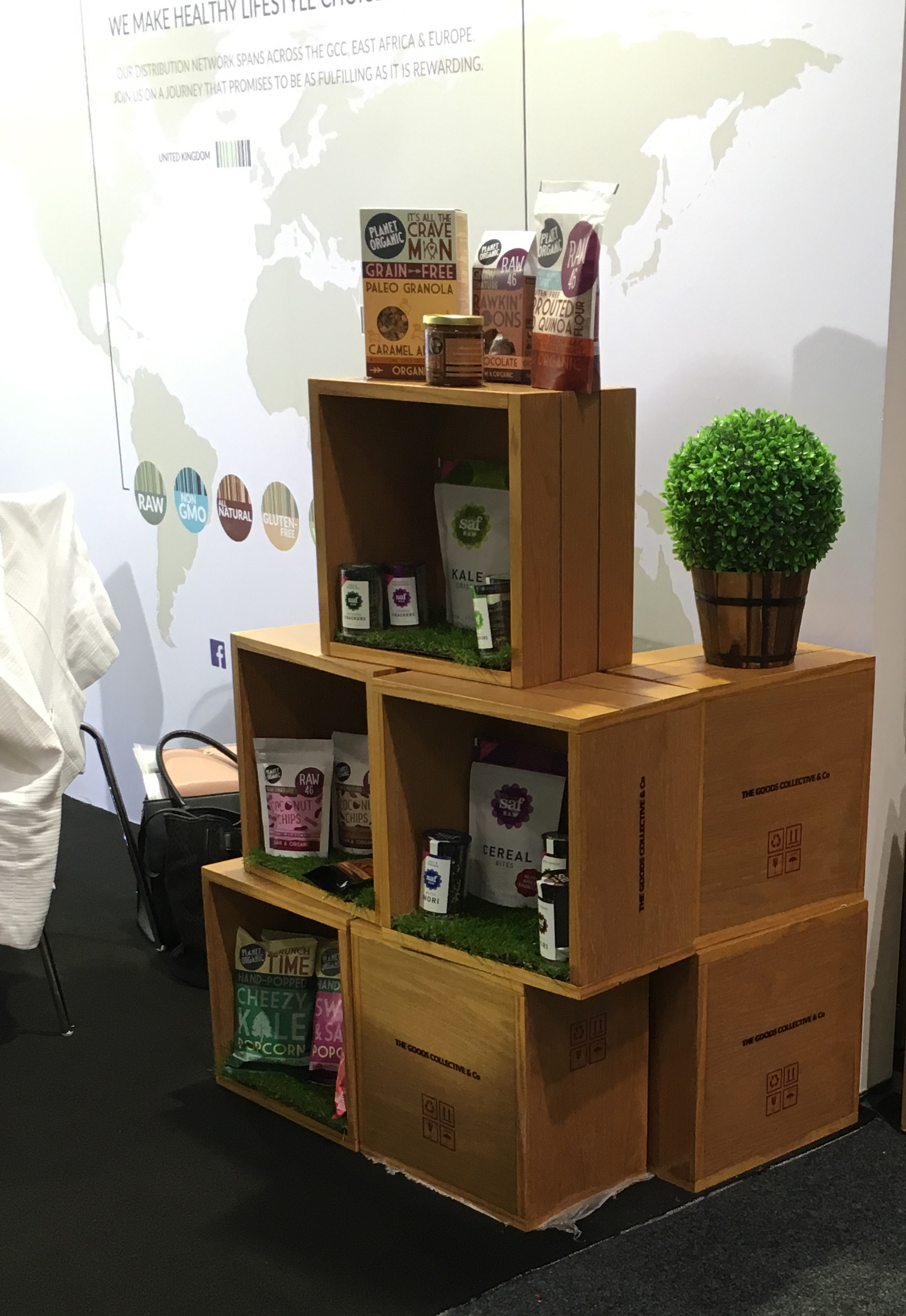
Based on the brand guidelines and design strategy previously developed by our team, a concept was created around 'organic', 'healthy' and 'natural' keeping the core business of a trading company with retail interests in mind. The entire look and feel of the exhibition stand design was inspired by pallet boxes that are typically used by trading companies for transporting and distributing products around the world, along with a modern contemporary look to complement the brand identity.
The walls were custom designed to display the best selling products as per category, enhanced with concealed spotlights making the stand design standout at the exhibition.
We designed a heat branded trolley that operated as a display for products, a product sampling table and also to dispense the company profile and product catalogs.
Custom designed pallet boxes were stacked in different formations to display more products, for optimum utilisation of available space in a 3M X 4M exhibition stand area.
CATEGORY WINNER
The exhibition stand design was so successful for our client that they were nominated and even won 1st place in the 'Best Functional Product' category at the post event ceremony!
WEBSITE
In parallel, we designed a dynamic E-commerce/corporate website for TGC&Co which includes a blog area and Facebook integration.
IN-EXHIBITION DESIGN & MATERIALS_
Individual Sampling Trays - Shopping Bags - Giveaway Pouches - Company Profile + Catalogs for each brand, etc.


